The Gold Slide Isn’t Over
By Mark Dow
Sentiment has dramatically shifted on the precious metals. The gold bugs have gone silent or are desperately trying to re-frame their pitches. Meanwhile, the bears have gotten loud, and people previously claiming neutrality -- in no small part out of fear of wrath from the gold bug crew -- now feel free to pile on.
With such a significant change in conviction, does that mean the slide is over? The short answer is no. The longer answer makes the case clearer and requires explanation.
Gold is a bubble. The selloff is not recent. It has been going on for two years. What has changed is that we’ve entered the acceleration phase of the decline.
If you have resisted this idea up until now, you still have time to come clean with yourself. The legs on which the post-QE phase of the gold ramp was built have cracked. No hyperinflation, no systemic collapse, no fiat debasement. The biggest misconception of all, that "printing money" causes inflation, has been thoroughly discredited by anyone who followed the debate closely. In fact, collective fears seemed to have tipped in the direction of deflation.
This shift in thinking has been mirrored in the precious metal markets. They reacted to QE1 and QE2, but by the time QE3 rolled around, monetary stimulus lost its juice, as investors increasingly got past the arm waving.
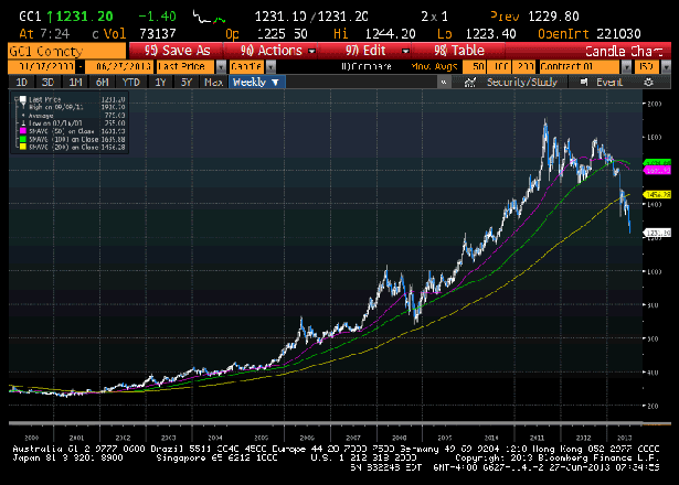
You can see it this on this chart (all charts via Bloomberg):
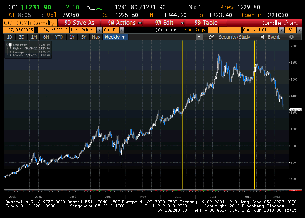
The left-most yellow line shows the sharp upward turnaround in the price of gold when the Federal Reserve first went nuclear in late 2008. Similarly, when Fed Chairman Ben Bernanke dropped heavy hints at Jackson Hole in August 2010 that more monetary easing would follow, the precious markets responded strongly and positively (middle yellow line).
However, as time marched forth and the inflation/debasing fear that motivated much of the rush into gold didn’t materialize and the economy continued to heal below the surface, the shiny metal rallied progressively less to every accommodative twitch out of the Fed. Those of us watching this market closely also noticed gold’s correlations to other assets were changing. Gold’s positive correlation to the equity market was all but gone, and its negative correlation to the dollar had declined considerably. In fact, things had changed to such a degree that by the time QE3 was trotted out, there was a brief bump in the gold price, followed by a sharp reversal. Gold has been on a one-way slide since (third yellow line).
So, how far do we fall?
It's important to note that the peak in precious metals coincided with the top in emerging markets equities (silver and the iShares MSCI Emerging Markets Index (EEM) peaked the same week). This is not random. The commodity boom had two phases -- both, by the way, turbo-charged by the arrival of ETFs.
The pre-QE phase was driven in large part by the shift in emerging markets and the extrapolation of their appetite for "scarce" commodities. Both asset classes are now well into their unwind. (More on that here.) The post-QE phase of the commodity boom was narrower. It may come as a surprise to note that the price of oil is roughly unchanged since QE started. The big run-up in the price of oil came in the pre-QE phase, driven by the emerging markets story, as you can see here:

The gist is that the post-QE commodity rally was heavily concentrated in precious metals. This matters a lot if you want to make an educated guess as to how far gold can fall. The chart is pretty ominous:
The implication is that markets increasingly believe the Fed will let its book of QE roll off and that its much-discussed exit strategy will transpire without systemic collapse or rapid inflation. And as a result, we are likely to revert roughly to pre-QE levels for precious metals. You may still believe catastrophe awaits, but by now you should at least concede that the scope for saying "no, not yet -- I was just early," is unambiguously contracting.
What does that reversion look like? Note the highlighted band:

I am not a huge fan of targets. But I am a big fan of concepts. And if you think the market got its monetary gloom and doom QE analysis wrong, it does make sense that pre-QE levels are where cruel reversion is likely to take us. That range you see on the chart above is $700 to $900 for gold. If you think any of the emerging market/pre-QE phase of the gold rally should unwind, then gold would have to of course fall fyrther.
Another reason to believe there's much more selling to come is illustrated by the chart below, showing total known ETF gold holdings:

Holdings have fallen less than the gold price itself. As an economist would say, this means the price elasticity of gold demand is very low. In other words, the price of gold fell disproportionately to the quantity of gold the sellers were able to unload.
Many like to say “for every seller there is a buyer, so what’s the big deal?” This misses the important point of elasticity -- it's not symmetrical. And elasticity is extremely sensitive to animal spirits. Buying $300 million of gold can move the market up by less than a percent in normal times. But when sentiment for gold turns adverse, selling $300 million can drive it down, say, 2% to 3%.
The upshot is this often leads others who have decided to sell, but have not executed, to freeze. Just like when it comes to selling your house and you don’t “like” the market price. This leaves a backlog of trapped longs and results in many praying for an uptick. I think we all know how this story ends.
The trapped long chart for silver is even worse:

There are ways to manage your position and your mental capital if you are a trapped long. If you haven’t been involved and are looking to go short, there are also ways to get into a short position that mitigate the risk of "chasing." I'll write later about how to employ these strategies. Until then, good luck.
