The 1 Stock Market Correction Table You Need to See
Following one of the calmest years on record for stocks in 2017, last year was a wake-up call of epic proportions.
In 2018, the stock market underwent not one but two separate corrections, the latter of which is still ongoing. Though this might come as a surprise given how accustomed investors have become to new all-time highs, there have been 37 corrections in the broad-based S&P 500 (SNPINDEX: ^GSPC) since 1950, according to data from market analytics firm Yardeni Research. In this instance, I'm defining a correction as a decline of at least 10% in the S&P 500 (i.e., no rounding up) from a recent high. That's a correction every 1.86 years, on average.
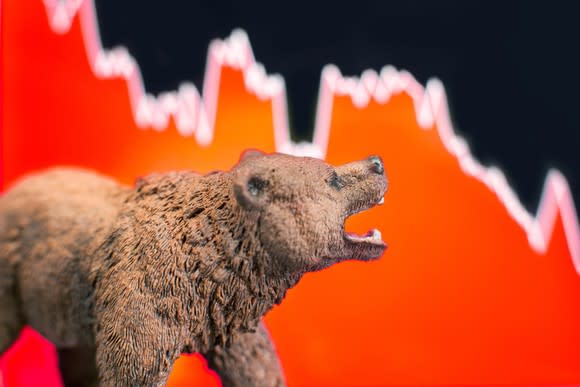
Image source: Getty Images.
Of course, we know full well that the stock market doesn't adhere to averages, even if we as investors would love it if that were to happen. The current correction, which dipped ever so briefly into bear market territory for the S&P 500 and more decisively so for the tech-heavy Nasdaq Composite, has ruffled feathers on Wall Street and built a wall of worry with tangible concerns.
Bearish signals abound
For example, the ongoing trade war between the U.S. and China has the real ability to negatively impact GDP growth for the two largest economies in the world. Even with the two sides in the midst of a 90-day tariff truce, there's been no indication that any meaningful long-term trade deals are in the works.
The bond market has also been giving off plenty of warning signs. Falling 10-year Treasury yields imply that investors are seeking the safety of bonds as opposed to the volatility of the stock market. Remember, bond yields and bond prices move in opposite directions, so as people buy bonds, thus driving up their price, the yields on those bonds will fall.

Image source: Getty Images.
This bond-buying activity has caused a lot of chatter about a possible yield curve inversion. The yield curve -- a visual representation of Treasury bond yields of varying maturities -- usually slopes upward and to the right in a healthy economy. In essence, longer-term maturities have higher yields than short-term maturities, which is important since banks borrow at short-term rates and lend at long-term rates. A narrowing of this gap, or an inversion, whereby short-term yields exceed longer-term yields, is typically a worrisome sign. In fact, while it's no guarantee of a recession, a yield inversion has preceded every recession since the end of World War II.
These and other factors have some investors questioning whether they should be heading for the sidelines. But as you'll see in a moment, staying the course is going to be your smarter move.
The one stock market correction table you need to see
From a visual perspective, the past 12 months have been incredibly volatile. Nine of the 20 largest point increases (not to be confused with percentage increases) in the iconic Dow Jones Industrial Average (DJINDICES: ^DJI) have occurred since early February, with 11 of the largest single-day point declines in the Dow happening over the same time frame.
This volatility has undoubtedly chased some folks to the sidelines. But here's why sounding the retreat is such a bad idea:

Data source: Wikipedia. The Dow Jones Industrial Average's 20 largest point gains and declines of all time.
In the table above, you see the Dow's 20 largest point gains of all time, which are highlighted in green, and the 20 largest point declines of all time, which are highlighted in red. You'll also see a kaleidoscope of colors used in the date column for these large up-and-down moves. What these colors represent are corresponding moves that occurred within a three-week time frame.
For example, the yellow highlight on Dec. 24, 2018, and Jan. 3, 2019, marks the Dow's respective 13th- and 12th-largest point losses in history. But as you can see on the left-hand side, the Dow also tacked on its largest and fourth-largest point gains in history on Dec. 26, 2018, and Jan. 4, 2019, which are also highlighted in yellow. Each color in the loss or gain date column correlates to within a three-week period of a date in the opposing column.
In total, 31 of the 40 largest point moves in history (77.5%) have occurred within a three-week period of a move in the opposite direction. Put in another context, if you head for the exit because of a large point loss in the market, there's a very good chance that a top-performing day is soon to follow -- and you're going to miss it.
Timing the market can be your undoing
How big a deal is it to miss these big up days? Back in 2016, when the stock market underwent its last sizable correction prior to last year, J.P. Morgan Asset Management released a report entitled, "Staying Invested During Volatile Markets." The report examined the S&P 500's best and worst single-day performances over a 20-year period between Jan. 3, 1995, and Dec. 31, 2014.

Image source: Getty Images.
If an investor had held throughout the entire 20-year period, which included the dot-com bubble bursting and the Great Recession, two of the largest stock market declines in recent history, they'd have ended the period higher by 555%, or an average annual return of 9.9%.
However, if they had missed just 10 of the top-performing days in the S&P 500 over this more-than-5,000-day trading period, their return would have been more than halved to 191%. Miss a little more than 30 of the top-performing days, and your return would be negative.
The point is that trying to time the market is the undoing of short-term investors, and the data shows it. The next time the stock market presents with a large nominal point decline, take a deep breath and reference the table above. Doing so could save you from making a rash decision and costing yourself substantial long-term gains.
More From The Motley Fool
Sean Williams has no position in any of the stocks mentioned. The Motley Fool has no position in any of the stocks mentioned. The Motley Fool has a disclosure policy.
