3 Big Stock Charts for Monday: MSCI, Macerich and Abbott Laboratories
The market tried to work its way back into a bullish groove and end the week on a high note, but to no avail. By the time Friday’s closing bell rang, the S&P 500 was 0.49% lower than Thursday’s last trade. The true direction of the undertow remains in question.

Source: Shutterstock
Netflix (NASDAQ:NFLX) did more than its fair share of the damage, tumbling more than 5% after CEO Reed Hastings conceded looming competition from Walt Disney (NYSE:DIS) and others would be impressively tough. At the other end of the spectrum, though not by enough, was Fitbit (NYSE:FIT). The fitness tracker ticker jumped more than 11% on a rumor that it was considering selling itself to a so-far-unnamed suitor.
Headed into the new trading week, it’s the stock charts of MSCI (NYSE:MSCI), Abbott Laboratories (NYSE:ABT) and Macerich (NYSE:MAC) that are of the most interest. Here’s why, and what’s apt to be next.
InvestorPlace - Stock Market News, Stock Advice & Trading Tips
Macerich (MAC)

Macerich shares have been losing ground for a couple of years now, with seemingly no end in sight. Although up for the past few weeks, that move didn’t necessarily snap the losing streak.
Except, that gain may have set the stage for a recovery effort. After such a prolonged selloff, the stock’s certainly ripe for a rebound. And, another missing link has finally materialized. Fortunately, the lines in the sand have become very clear.
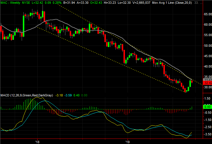
• The most important of those lines is the one that has steered MAC stock lower since the August-2018 peak, marked as a yellow dashed line on both stock charts.
• The action over the course of the past month exhibits many of the clues of a reversal. Namely, volume swelled into the bottom from last month, and the turnaround has taken shape on even higher volume. It’s a sign of a pivot from a net-selling to a net-buying environment.
• Even if the falling resistance line is broken, notice the gray 100-day moving average line could still bring a quick end to that effort. It needs to be cleared as well.
Abbott Laboratories (ABT)

The past couple of months haven’t been especially good ones for Abbott Laboratories shareholders. After an incredibly bullish summer following a great start to the new year, the stock has fallen back.
That selloff is part of a well-established pattern, though, and that pattern has been amazingly well defined by straight support and resistance lines. ABT stock is somewhat in limbo right now, trapped between various floors and ceilings. Whether you want to buy it or short it depends on what happens next, and your intended timeframe.
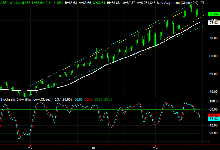
• There are two sets of support and resistance levels. The lesser ones are marked as yellow lines on both stock charts, while the bigger ones are plotted in light blue.
• Though edging lower, the gray 100-day moving average line has thus far held up as a support level, much like it did back in May.
• The white 200-day moving average line is also in play here, so if the short-term, yellow floor that’s guided Abbott to higher lows since the end of last year doesn’t hold up, ABT stock doesn’t necessarily have to fall all the way back to the mid-$70’s.
MSCI (MSCI)

Finally, although MSCI looked (and was) unstoppable through the first half of the year, the rally was stopped cold as the second half began. It didn’t slip over the edge of the cliff though, so to speak, until last week — and Friday in particular — when a sizeable stumble dragged shares below a trio of key moving average lines. Those same moving averages, in fact, also dished out sell signals of their own.
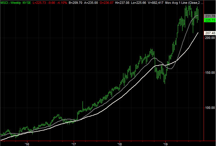
• The divergence of those three moving average lines that started to take shape in February has not only ended, the convergence is starting to become a divergence again … in the other direction.
• Take a close look at the daily volume bars, and the red, bearish ones in particular. They’ve become decidedly taller than average since July, and continue to rise.
• Zooming out to the weekly chart of MSCI stock makes clear just how overextended this off-the-radar financial services was. It also illustrates how the gray 100-day moving average line has been a make-or-break level in the past … the white 200-day moving average line as well, although less so.
As of this writing, James Brumley did not hold a position in any of the aforementioned securities. You can learn more about him at his website jamesbrumley.com, or follow him on Twitter, at @jbrumley.
More From InvestorPlace
The post 3 Big Stock Charts for Monday: MSCI, Macerich and Abbott Laboratories appeared first on InvestorPlace.
