5 Ways Headline Unemployment Hides How Bad It Really Is
Image Source: http://www.flickr.com/photos/kentuckyunemployment/
In November, the headline unemployment rate in the United States fell 0.3 percentage points to 7.0 percent, the lowest rate in five years. Total non-farm payroll employment rose by 203,000, and the total number of unemployed persons declined to 10.9 million.
The news, at a glance, was great. After years of underwhelming economic growth, it appeared as if the labor market was finally getting ready to leave the hospital. The U.S. Federal Reserve, playing doctor, announced in December that it would begin tapering asset purchases in January, effectively lowering the economy’s prescription of stimulants and signalling faith in the recovery. Fed policymakers have projected that headline unemployment will close out 2014 between 6.3 and 6.6 percent, a more optimistic outlook than was offered in September.
But labor market data is opaque, and the headline unemployment figure masks important characteristics such as marginally attached or discouraged workers. The headline rate is also sensitive to changes in the labor force participation rate, which, if it falls, can bring down unemployment without any jobs actually being created. Let’s take a look at a couple of ways in which labor market data can be misleading.
1. Labor force participation
Headline, or U-3, unemployment is calculated by the Bureau of Labor Statistics as the total number of unemployed people as a percent of the civilian labor force. The labor force is those adults (aged 16+) who either are working, or are looking for work. The labor force calculation excludes those in the military, institutionalized, retired, or anyone who is simply unwilling or unable to work. As of November, the civilian labor force in the U.S. was 155.3 million. With 10.9 million total unemployed people in the country, this yields a headline unemployment rate of 7.0 percent.
Labor force participation is most often talked about as a rate — that is, what share of the total U.S. population is participating in the labor force? In November, this was 63.0 percent, a rate that is about three percentage points below its pre-crisis level. The graph below shows that the labor force participation rate has declined fairly dramatically in the wake of the recession.
There are a couple of reasons why this is happening — one is that the Baby Boomer generation is beginning to retire, but another reason is that workers have become discouraged and simply left the labor force. This kind of “exodus” from the labor force can put downward pressure on the headline unemployment rate even though labor market conditions aren’t actually improving.
2. Marginally attached or discouraged workers
Since the headline unemployment rate doesn’t include discouraged workers — those who have simply given up searching for work — in its calculation, it paints a somewhat rosier picture of the labor market than exists in reality. The headline figure also glosses over those who are marginally attached to the workforce, the underemployed, and those who are forced to work part time for economic reasons (that is, they would rather be working full time but have not been able to find full-time work). U-6 unemployment is a broader way to measure unemployment, and it tries to capture these demographics. According to this measure, effective unemployment in the U.S. is 13.2 percent.
3). Employment-to-population ratio
Another way to survey the health of the labor market is to look at the employment-to-population ratio. Because the headline unemployment rate is determined using the labor force participation rate, it sometimes offers an incomplete picture of the changing labor market environment. The employment-to-population ratio plummeted in the wake of the crisis and has not recovered alongside the headline figure.
Some economists have argued that the Federal Reserve should target a measure of full-time employment such as the employment-to-population ratio or Gallup’s payroll-to-population ratio instead of headline unemployment, because of some of the problems outlined above.
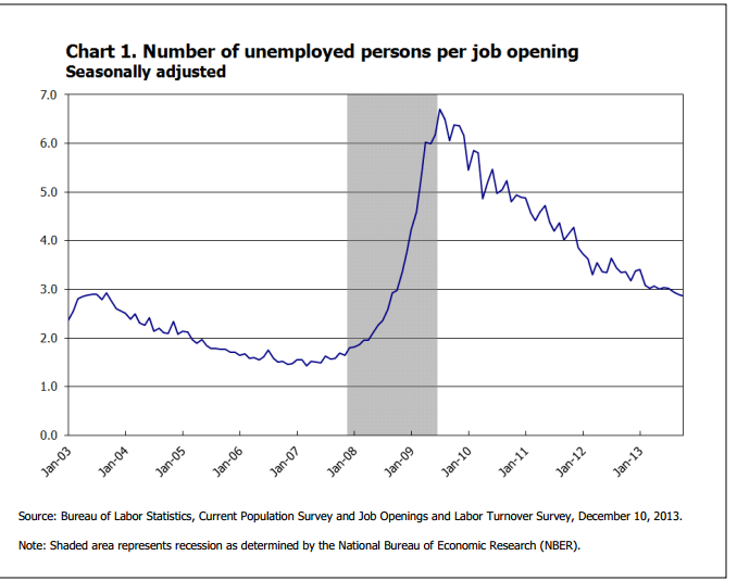
Source: http://www.bls.gov/web/jolts/jlt_labstatgraphs.pdf
4. Job seekers versus job openings
For every job opening in the U.S. right now, there are about three job seekers. As of October, the most recent month for which there is data, there were just 3.9 million job openings for the nearly 11 million unemployed people in the country seeking work. The number of unemployed people per job opening spiked during the crisis and has only somewhat moderated in the following years. A rate near 3.0 percent is historically high.
5. The ‘quits’ rate
The ‘quits’ rate is simply the rate at which workers quit their jobs. At a glance, people may not read into this number, but economist Paul Krugman does. Krugman recently argued in a New York Times op-ed that a low quits rate suggests that workers are afraid to quit their job, even if they are unhappy, because they fear they won’t be able to find another one. He described this phenomenon as “The Fear Economy.”
“The fact is that employment generally involves a power relationship: you have a boss, who tells you what to do, and if you refuse, you may be fired,” he wrote. “So employment is a power relationship, and high unemployment has greatly weakened workers’ already weak position in that relationship.”
More From Wall St. Cheat Sheet:


