The Apple icons you see today have surprisingly ancient roots
In the early 1980s, Apple asked a young artist named Susan Kare to design some graphics for its forthcoming personal computer, the Macintosh. Kare had never worked in the tech industry and didn’t have any experience with computers. But she had a background in a variety of art forms, from mosaics to needlepoint, and a PhD from New York University, having written her dissertation on the use of caricature in sculpture. As it turned out, this diversity of experience was exactly what Apple needed.
Kare’s artistic background made her well-equipped to aid in Steve Jobs’ ambition to create the world’s first friendly computer. She was accustomed to finding inspiration in everything from hieroglyphs to street signs, and by bringing a diverse range of influences to the Mac, she made the brave new digital world feel decidedly familiar.
The fact that the Mac had a graphical user interface at all was exciting in its own right. But Kare’s joyful icons made the computer look truly unique. Whereas the IBM PC, released in 1981, was, as PC World’s Benj Edwards put it, designed to look like a “serious computer for serious business,” the Mac—thanks to Kare—made using a computer look downright fun.
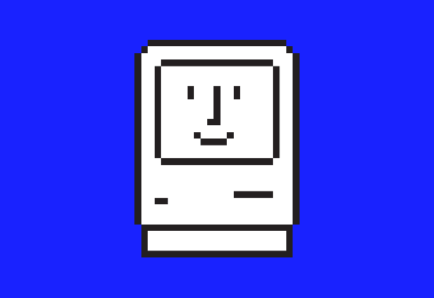
The Mac—thanks to Kare—made using a computer look downright fun. You’re probably familiar with Kare’s work, even if you don’t know it. Her suite of icons for the original Macintosh in 1984 helped people learn to navigate an unfamiliar technology—the personal computer—with help from intuitive symbols. A tiny stopwatch urged users to have patience while an application loaded, while Kare’s “Happy Mac” greeted users with a reassuring smile as they booted up their computers. “One of the stated goals for the Macintosh project was that the computer should be friendly and appeal to non-technical users,” Kare said in an email. “Because it took a bit of time for the software to launch, I was asked to design an icon so people would know something was happening. A smile just seemed like a good way to infuse a positive spin on the icon of the computer.” Kare’s overall aesthetic was playful and reassuring. Even the horror of encountering a system failure was somewhat mediated by her icon of choice, a plucky cherry bomb with a lit fuse.
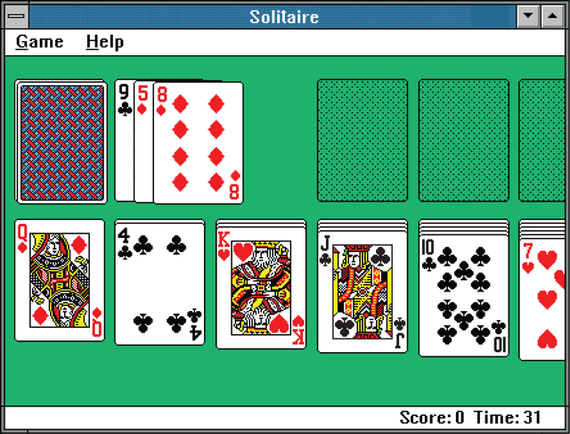
In the years since the Mac’s debut, Kare has brought her warm, clever style to a number of other tech giants, designing everything from the playing cards for Microsoft’s famously addictive game of Solitaire to Facebook’s virtual gifts, which the platform offered from 2007 to 2010. Today, she works as Pinterest’s creative designer, where she’s made her mark by designing, among other things, the brand’s signature red pushpin.
Before landing the job at Apple, Kare had dreamed of designing greeting cards for Hallmark. It’s a real stroke of luck that she turned out working in tech instead. Without her influence and open-minded, exploratory approach to design, our digital world might be a lot less friendly.

Eclectic inspiration
When Apple and Kare found each another in 1982, she was living in Palo Alto and in the midst of “welding a life-sized razorback hog” as a statue for a museum in Arkansas. Her friend from high school, Andy Hertzfeld, was working on Apple’s Macintosh team, and he got in touch to see if she might want to create some graphics for their new project.
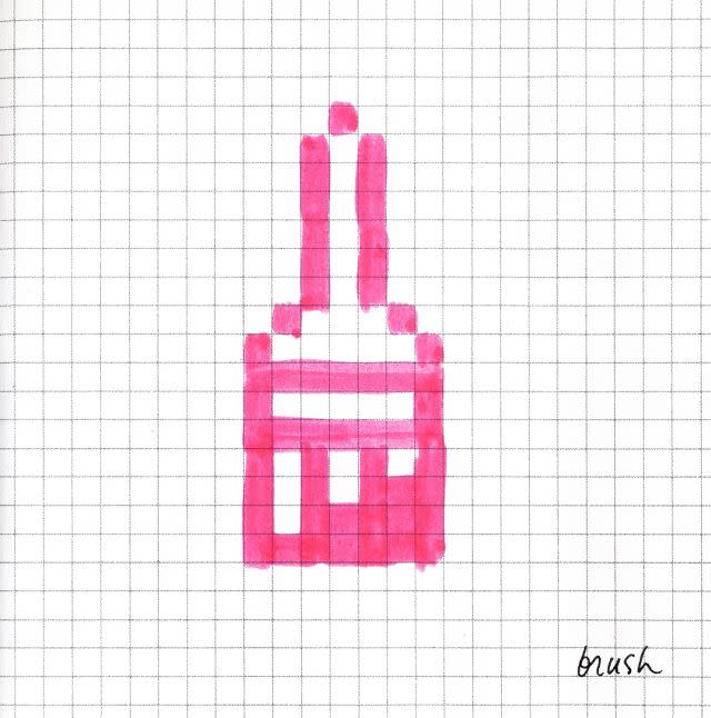
Duly intrigued, she bought some graph paper from the art supply store and began sketching, filling in the tiny squares with a pink marker in order to imitate Apple’s pixelated displays. Soon she graduated to creating her designs on an icon editor in Apple’s Cupertino headquarters. Kare remembers the period as a time in which she was surrounded by smart, creative people who were happy to be working together on something new and exciting, and but unaware of how big the Mac would become. “You can set out to make a painting, but you can’t set out to make a great painting,” she told Steve Silberman in the introduction to the book Susan Kare Icons, which was excerpted in Fast Company. “If you look at that blank canvas and say, ‘Now I’m going to create a masterpiece’—that’s just foolhardy.”
“You can set out to make a painting, but you can’t set out to make a great painting.” Among Kare’s enduring legacies is the way her icons have integrated a wide range of cultures into our everyday computer culture. Kare based the Macintosh “command” symbol (⌘), for example, on a sign used on Swedish campgrounds to denote interesting locations. “It lent itself to being digital without being jagged,” she said in a 2000 interview with Alex Pang for Stanford University. She also drew inspiration from pirates, ancient hieroglyphs, books on craft and folklore, and from the Symbol Sourcebook, a 1972 guide to graphic symbols that includes everything from astrological signs to the markings that hobos left behind on buildings to help guide one another on their travels. (The hobo sign for “these people are rich,” it turns out, is a top hat and a triangle.)
The diversity of her sources helped her find imaginative ways to communicate abstract ideas. “‘Undo’ remains an unsolved problem (claw hammer pulling out a nail?) along with a number of other perennially tough verbs to symbolize: sort, save, inspire,” Kare explained. An additional challenge was remembering to accommodate international users with icons that didn’t rely on the English language. Kare briefly experimented with using an icon of a cat in a mirror (“copycat”) as the icon for “copy,” but quickly relinquished the idea; puns didn’t translate.
All of these considerations meant that Kare had to approach her work as if solving a puzzle. “I find it really interesting to solve that problem of, how do you make a concept in 16-by-16 black and white dots?” she told Pang. While she’s not necessarily a fan of limitations, she understands how to work within them. “Technical constraints don’t necessarily hamper creativity.” “Technical constraints (such as working in black and white, or limited screen real estate) don’t necessarily hamper creativity,” she told Quartz. “It’s just good to understand what’s possible, and work from there. That’s true in most design projects, not just digital. I still believe that just because you can use millions of colors and hundreds of fonts, you don’t need to use them all in every project.”
Kare was also charged with designing original fonts for the Mac. “The chance to create a set of bitmap (pixel) fonts for the Macintosh was a terrific opportunity because the new path-breaking technology enabled proportionally spaced characters—an “i” and an “m” could have different widths,” Kare told Quartz. “Most earlier computer fonts were monospaced.” In contrast to the smooshed-together fonts that prevailed at the time, Kare’s fonts “allowed text to breathe as naturally on the Mac’s white screen as it does in the pages of a book,” Steve Silberman writes in the Fast Company excerpt.
Her fonts for the Mac included Chicago (the Mac’s default san-serif typeface through system 7.6 in 1997, as well as on early versions of iPods), New York, Monaco, the wacky San Francisco (originally named Ransom, because its collage of letters looked like a ransom note), and Cairo—a dingbat font that was particularly useful in the pre-emoji era, which allowed people to insert images of palm trees, mittens, and treble clefs with a stroke of the keyboard. (The most famous dingbat in Cairo was the dogcow, a sweet and spotted critter who gained celebrity status starting in the late 1980s, when Apple’s software used him to illustrate the orientation of the page, in either landscape or portrait mode, that users had selected to print.)
Today, Kare continues to draw inspiration both from books—a tome on Kanji pictograms is another favorite—and from the sights she encounters in her travels, online and off. “I often find myself taking photos, for example, of images stenciled on the sidewalk, handmade signs, interesting packaging, or warning labels on trucks,” Kare told Quartz. “And of course, on my daily trip around the internet I save random images and often get graphic inspiration from Pinterest.”
Her more contemporary digital designs, like her early work for the Mac, are a testament to Kare’s continued ingenuity. Though her images live on our screens, her attention to detail gives them movement and life. Consider the virtual gifts she designed for Facebook: a nut brownie looks more delectable because it’s surrounded by a scattering of crumbs, while a lime-green popsicle gains credibility because it’s slightly melted in the imaginary heat. More recently, Pinterest opened a cafe at its San Francisco headquarters in 2018 selling Kare-designed mugs, stickers, and enamel pins. One pin shows a pair of bunny ears, meant to signify the joy of getting sucked into an internet rabbit hole. Another shows Pinterest’s signature pushpin—made more lovable, naturally, with the addition of a smiley face.
Corrections: An earlier version of this post referred to the Mac as Apple’s first computer. The original post also incorrectly identified Steve Silberman as the author of Susan Kare Icons; he wrote the introduction to the book.
Sign up for the Quartz Daily Brief, our free daily newsletter with the world’s most important and interesting news.
More stories from Quartz:
