Exclusive: Hostinger mobile update allows website creation and editing on your smartphone

Hostinger has introduced an update to its website builder that allows users to edit their work using only a smartphone.
The new mobile editor update aims to simplify the overall website building process, enabling users to build and manage websites even while on the go.
The redesigned UI and touch-friendly controls will help Hostinger users easily switch between desktop and mobile to continue working on the website.
Hostinger mobile editor
The company says the update was motivated by following a rise in demand for a mobile-friendly website by its users.
"Our clients access Hostinger website builder on mobile devices daily. We understand the importance of ensuring their user experience is as simple and convenient as possible. After all, this is what Hostinger website builder is all about – enabling web beginners and business owners to easily create a professional-looking website. No coding and web design skills needed,” said Giedrius Zakaitis, Chief Product Officer at Hostinger.
The new Hostinger mobile editor update transforms the user interface (UI), making it closely resemble a smartphone app. The main controls and features have been tailored for touchscreen use, ensuring an intuitive and seamless user experience.
Users will be able to create a website by answering just three simple questions, with Hostinger's AI then generating their website based on the responses. Alternatively, users can select from 150 designer-made templates and customize them to suit their preferences.
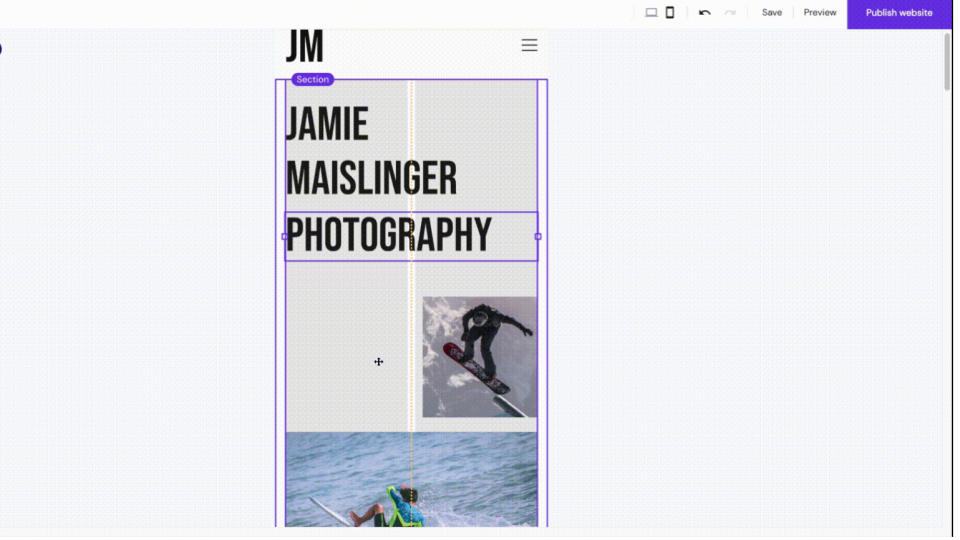
All the usual essential website editing features are accessible through the Action menu. Users can effortlessly add and modify various elements such as posts, pages, text boxes, images, buttons, etc. Each element can be easily moved, resized, and edited, providing flexibility in design and layout.
Moreover, the AI Assist feature aids in generating SEO-friendly copy, while the Analytics tool allows users to track website traffic statistics and trends. The updated mobile editor ensures a seamless transition between desktop and mobile devices, allowing users to work on their websites anytime.
More from TechRadar Pro
Hostinger's new AI tool can write your entire blog post so you don't have to
We've also reviewed the best web hosting providers
