
The Real Reason Why People Say Apple's iOS 7 Icons Look So Terrible
Apple
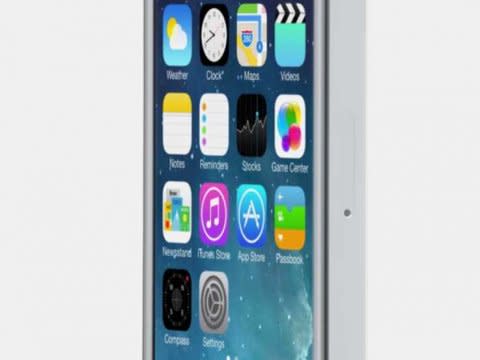
Apple disappointed a lot of people when it unveiled its latest mobile operating system, iOS 7, last week.
Some professional designers called iOS 7 ugly, inconsistent, and confusing.
Drew Breunig, senior director of strategy at hyper-local ad startup PlaceIQ, has a theory behind why iOS 7 just isn't up to par.
It's because Jony Ive, Apple's senior VP of design, is used to meticulously designing hardware.
Ive designed every icon around a new grid system in an attempt to "create a more harmonious relationship" between each element.
But Breunig argues that software design doesn't need to be as rigid as hardware design, where you design things down to fractions of centimeters.
"In software, such exactness isn't necessary and is perhaps, well, wrong," Breunig writes.
Ive has only been in charge of software design since last fall, after Apple's former iOS boss Scott Forstall left the company. Forstall was mostly responsible for the texture-heavy, skeuomorphic design interfaces found in older versions of Apple's mobile operating system.
So it's important to keep in mind that iOS 7 was Ive's first major attempt at software design. Also, it already seems like Apple is tweaking the icons.
More From Business Insider
